The Analysis View offers a wealth of fascinating information about your contacts and their giving. The more information you have about your contacts, both in quantity and quality, the better you will be served by the Analysis View.
There are two primary components of the Analysis View:
| 1. | The upper section shows some analytical data about your pledges, overall support, outstanding pledges, and recent activities. |

Press the Send Weekly Coach's Update to Excel button.
This creates an Excel file summarizing your support activities for the week. In some ministries, a supervisor or support coach desires this report for staff who are actively raising support.

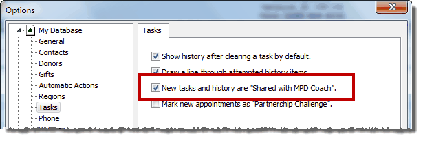
Note: You can also include the weekly activities themselves (not just the count of activities) by selecting the "New tasks and history are "Shared with Support Coach" checkbox in Tools | Options | Tasks tab.
Support Progress
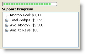
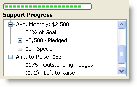
The Support Progress box shows you how your pledged support compares to your need. The green bar at the top represents the % of received pledges compared to your Monthly Goal.
Collapsed
|
Expanded
|
|
|
Monthly Goal
|
Your goal is defined in the Options.
|
Total Pledges
|
Total pledges is the monthly sum of all pledges for contacts whose TNT Phase is “PARTNER-Financial”. For partners whose gifts are less frequent than monthly (such as quarterly or annually), their gifts are recalculated to a monthly amount.
|
Average Monthly
|
Your monthly average is TntConnect’s computed current monthly average for Financial and Special PARTNERS.
Read More > How monthly average is computed
|
Amount to Raise
|
Monthly Goal minus Total Pledges.
|
Contacts & Referral Pool
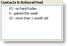
The Contacts & Referral Pool box tells you how many contacts you have whose TNT Phase is less than "Appointment Scheduled".
Contacts & Referral Pool
|
TNT Phase List
|
|

|
TntConnect uses the "Created Date" to determine if a contact was gained this week.
|
The TNT Phases included in the "contacts" count are
|
Notes:
| 1. | The expression "on hand today" means "in your database today" and for whom you can call for an appointment (that is, their |
| 2. | "Gained this week" refers to contacts that are new in your database this week, even if they have made a decision. (For example, you may have received a referral, called them, gone on an appointment, and received a decision, all in the same week.) |
Weekly Activities
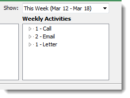
The Weekly Activities box summarizes all items in the History Tab for all your contacts for this week or any week in the past. (You define your week’s start day in Options.)
Charts
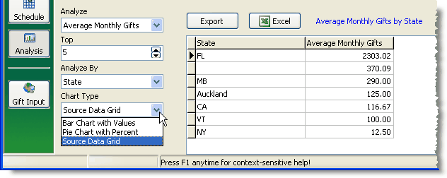
The lower section shows graphical summaries of your giving historically. You can choose from over 400 different combinations of charts.
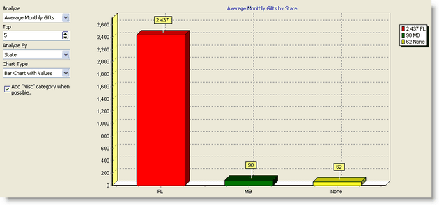
Checkbox: Add "Misc" category when possible. Combine all other categories into one column. This can be helpful when the Misc column skews the results.
The very cool graphical views of your support offer 3D views of gifts, pledges, contacts and more: 10 different reports you can view 14 different ways. The best way to learn about the graphical views is to just start clicking and see what you learn.
These charts offer more than just a fascinating look at your financial support. Ideally, charts will help you focus on the best places to raise your support. For example, if a certain state or province is where most of your donations come from, then that state or province is the place you probably want to seek new support.
